


‘Data’, ‘Information’ – Not the sexiest words. But pair them with ‘visualisation’ and ‘graphics’ and you can create something beautiful.
Information is beautiful
I’m a long-time fan of the work of David McCandless and his data design studio Information Is Beautiful, so when the opportunity came up for a colleague (Iain) and I to spend a day doing a workshop with him, learning how to create impactful infographics and data visuals, I jumped at it.
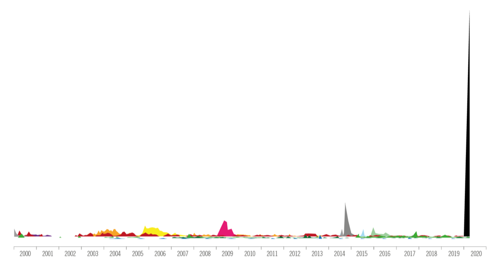
Of course this is the age of Covid so this was a remote workshop with around 200 other participants. Indeed, the first example he used was a visualisation of the comparative death tolls of recent outbreaks with coronavirus towering above the rest like some ominous Burj Khalifa.
After a brief inspirational tour of some of his previous work it was time to get busy…
What did we learn?
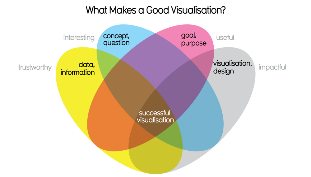
Well, many things but firstly, what it is that makes a good visualisation. It turns out it’s quite simple, at least in theory, and revolves around fulfilling four main criteria. It has to be: Trustworthy, Interesting, Useful, and Impactful. David spoke about beauty not just in the visual, but also how a visualisation can beautifully convey a concept in the most efficient way possible in two dimensions.
But “what is a concept?” you may ask. How does it differ from an idea? According to David, it is an idea that you can explain to someone else that they will immediately understand and will not require further questions to grok. An example might be expressed as a question such as ‘What is the effectiveness of a medicine vs a placebo?’ or ‘What really extends your lifespan?'.
We also learned how to go about conceiving a visualisation. Way before the design starts you need to research the concept, which in turn comes from the ‘seed’ of an idea, which might come from any number of inspirations such as a question, a dataset, a problem, and so on. Once you have the concept it is a matter of honing the ‘goal’ and identifying the metrics that you want to reveal.
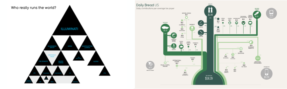
In terms of form and colour, inspiration can often come from the concept itself. For example David has created a tongue-in-cheek visualisation of conspiracy theories which takes the form of a pyramid, a common motif among those interested in power structures, and a visualisation about daily tax contributions which is rendered in green, echoing the colour of cash.
Putting it to use
It wasn’t long before Iain and I were able to use some of our new found knowledge, indeed the very next day I was able to use an insight from one of David’s examples in a particularly tricky piece of work showing the efficacy of a medicine, and Iain has been showing me an idea he’s been working on using a ‘bubble comparison’ visualisation technique to show relative values.
The potential for healthcare
The pharma and healthcare sectors rely heavily on communicating complex information to both professionals and the public alike. Companies hold large datasets which are often converted into rather mundane looking charts and graphs that in all likelihood are frequently overlooked. Using better data visualisations and infographics is one way of engaging an audience and making important concepts stick in the mind. So remembering the 4 criteria of Trustworthy, Interesting, Useful, and Impactful is a useful starting point when considering what it is we want to be showing to customers.
What useful datasets might you have access to that could potentially be mined to create compelling visualisations that connect with your audience?


