


I have a four year-old daughter/UX consultant named Alyssa.
I’ve run through various usability and UX tests with her, trying out different apps and digital experiences, taking note of where she stumbles and how she navigates her way around interfaces.
While this might sound like a cute anecdote, I would genuinely vouch for this method often being a more effective way of getting answers than working with a group of adults. Why?
Kids these days are digital natives
I have to admit that the amount of time my daughter spends looking at a screen concerns and delights me in equal measure, but I also accept that this generation is simply different.
Back when she skipped her first YouTube ad at 2 years old, I realized that kids are growing up in a world where understanding how to interact with machines is happening alongside language acquisition — and good UX is becoming as intuitive as syntax, semantics and pragmatics in a child’s primary language.
Kids grow up learning to navigate iPhones in pretty much the same way I learned to navigate around a coffee table in my baby walker.
Alyssa’s morning routine involves two main choices: picking a breakfast cereal and selecting a show on Netflix.

She comfortably navigates Netflix on iOS, Android, and using an Xbox controller… true cross-device mastery.
Best practices and intuition
UX designers are obsessed with the intuitive. We try to use familiar iconography, bear in mind the OS human interface guidelines, and often refer to apps like Facebook and Twitter. Not because we’re not creative or bold enough to try something different, but because there is a lot to be gained from using conventions in positioning, design-language and information architecture that users already recognize and respond to.
By learning her way around apps like YouTube and Netflix — Alyssa comes “pre-installed” with a lot of that knowledge, and when presented with an interface that challenges or breaks these expectations, it’s highlighted.
For example, when testing Pokemon Go, I’d notice her finger defaulting to positions where she expected a “back” button to be.
Kids are less biased
While they may be biased through familiarity with apps that, generally are considered industry standard, the most valuable lesson learned from testing apps with kids is that they don’t have any of the baggage and bias that adults come with.
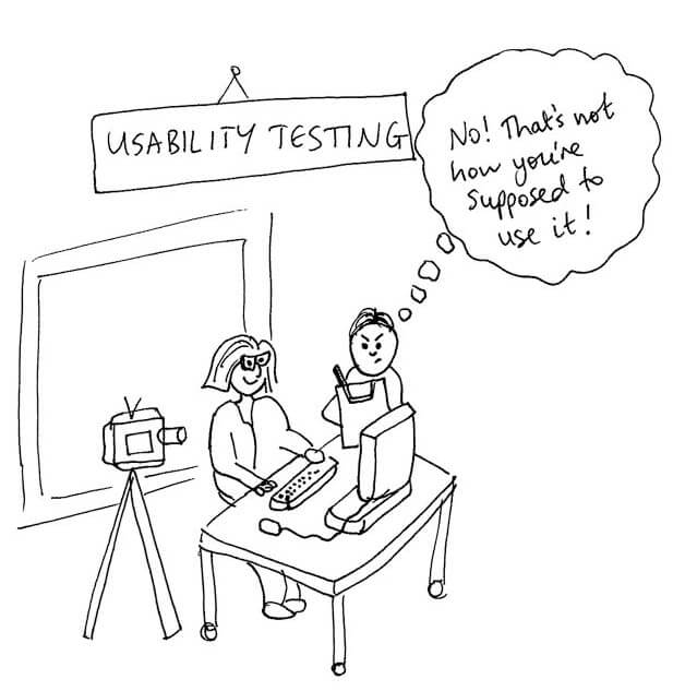
Adults tend to act unnaturally as soon as they know they are being observed for usability testing. And a tester’s body language and the phrasing of questions is always a hinderance when trying to capture qualitative feedback.
In test conditions, adults spend an unnatural amount of time reading and considering the text on a screen for example, when in real life they’d probably be flying through swipeable on-boarding instructions, “next next next”, like a row of sub-par Tinder suitors.
This is where a four-year old’s reading level is actually a more accurate analogy of the harsh reality of regular app users.
Adults afford apps they’re testing an unusual amount of patience. They also might work harder for fear of looking dumb when they can’t work out how to apply a filter to your ridiculously unintuitive photo app.
Learning Through Interaction
Alyssa keeps it simple. She has little time for text - but bold and clear icons she can recognize work well, and animated buttons and the use of motion will draw her attention. She’ll even follow the prompt of coach marks so long as they don’t get overwhelming.
She won’t attempt to read a big chunk of text, she learns complex UI through interaction, trial and error… so being able to navigate back and give it another go is vital.
Sometimes I’ll even tell her what to press and she’ll still try something else out just to see what happens. Most parents can probably relate.
If the potential reward is valuable to her, then she’ll persist with a problem until she finds the best route. Good examples are the ads and in-app purchase screens in far too many kids apps.
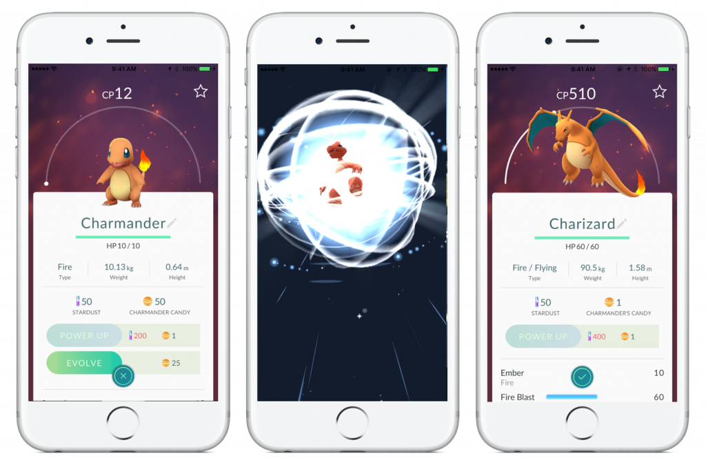
Pokemon Go is another good example of overcoming the cognitive challenges of a new UI.
Initially, she would open and close each Pokemon to verify whether the “evolve” button had turned green. Eventually, she uncovered the ability to swipe quickly between one Pokemon and the next, shedding one tap per screen view, and this has now become her default behavior.
All of these are principles that can be very useful to consider when thinking about information architecture, interaction design, and good UX.
Cross device testing
As I mentioned earlier, Alyssa uses Netflix on iOS, Android, and Xbox. Many kids don’t have their own device. And relying on parents to download applications often means kids have to learn to use several different interfaces to access the same content.

Most parents would be reluctant to buy a top of the range handset for their child, and many kids end up building their digital experience using several pre-owned devices that are handed down when their parents upgrade to the latest shiny iteration.
Alyssa has owned an iPhone 3GS and iPhone 5 running iOS 7. Ok, you’ll still need adults to check out UI issues with screen sizes, but that intrinsic fluidity in not being tied to a particular screen size or even operating system is actually quite rare with adults, who have the choice of brand and device loyalty through purchasing power.
If you’d like to gain a new perspective on your design process, consider hiring a four year old!


