


Taking a web design from a PSD (or similar) to an actual webpage can either be a fun and enjoyable experience or it can be slow and painful one. 'Why?' I hear you ask? Well keep reading and you'll find out!
Reviewing the design
So the PSD has just arrived in your inbox, you download it, open it and now it's time to determine how simple cutting this up will be to make it into a real webpage. It's safe to say you are likely to react in one of two ways…


Hopefully it's the first one! The designer has created an amazing design, the PSD is organised, you can easily find the pieces you need to pull out and lastly it is an implementable design! You can clearly see that the designer has thought about the developer and created a design that will definitely work on the web and could be made responsive, if required of course (but what isn't responsive nowadays?).
However, if it is the second way, I feel your pain. You're sat there, staring at this design, the only thought running through your head "What were they thinking?". No thought or consideration for the developer who has to now implement this design. The PSD is badly organised, nothing has been named properly, you can't find the layer that contains that really weird shape. Nothing is going right for you right now and you haven't even written any code yet.
Side note, if you do have the second reaction, you can bet this is the designer right now…

Time to write some code
Okay so you've reviewed the design, you're either feeling like Dicaprio or Chan and now it's time to start building this design. There are some things that you've got to think about, some of which you will probably have already started to consider whilst reviewing the design. In no particular order these are:
- HTML/CSS vs Image
- Browser support
- Javascript
- Responsive
Let's break each of these down and go into a bit of detail about what each of them means for you.
HTML/CSS vs Image
I've briefly mentioned cutting stuff up or pulling things out of the design, so now you're at the stage of actually building the web page you need to make sure you make the right decision.
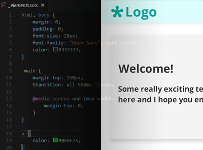
Let's take a simple example, imagine you had the design below:

We've got a header bar with a logo and some links, then in the body of the page a rectangle card with some text and the icon from the logo. So what are your first thoughts upon looking at this? What do you think you should be using HTML and CSS for vs cutting out an image?
Made your decision yet?
The answer… Only the logo in the header bar and the logo icon in the page body should be cut out. These can't be created in HTML/CSS or if you think you can do it you are literally a CSS God! But if you are a mere mortal like me, you'll cut these out and that's totally fine and the sensible thing to do.
HTML and CSS can cover the rest of the design no problems, you've got a simple box, some varying background colours and some shadow. All of which can be done with CSS. So now all you've got to do, is write some nice clean HTML along with some CSS and you're all done!
Important side note to make here, if you have the ability to have the logo and any icons as a vector, then do make sure you use that to cut out the logo, you'll produce a higher quality version and also gives you the option to produce retina ready images - but we're not gonna talk about that here.
Browser support
Supporting older browsers is definitely every front end developers worst nightmare. Here's another meme to represent how we feel, you know because it had been a while since we had a meme:

Now we've got the meme out of the way we can get back to the design. The browsers you need to support will effect how you decide to do certain things. You may need to use plugins to help older browsers do what the new ones can do already. These are referred to as polyfills and they can become your saviour every now and then. You might want to use some CSS3 features, but below IE9, they aren't supported, so finding a polyfill or a javascript plugin to get the job done may be your only option.
There are hundreds of developers out there who have written polyfills to help solve a lot of these problems. But one website that is particularly useful when trying to determine what you can use and what browser supports what is CanIUse. You just type the feature you want to use and it will tell you what browser support it or even if partially supports it with the issues it has. I have used it countless number of times so I highly recommend you look into it!
In short, supporting older browsers can be difficult to do, and sometimes you just can't implement certain features, but for so many things there are polyfills and tricks that can help and make it work just as it does in the newer browsers.
Javascript
Woo bit of javascript talk now! You may need to use javascript as mentioned above for certain polyfills but also you may need to use it to implement a certain feature that is in the design. Some examples of this could be:
- Carousel
- Accordion
- Form validation
- Drag and drop
- Modals
- Datepickers
The list could go on and on as there are thousands of javascript plugins out there. These plugins often have been used many times and therefore you can confidently use them, especially if they are continually updated. When I am cutting up a design, I have a set of plugins that I always refer back to. That way I know exactly how to use it and can get it going really quickly.
So when you are cutting up a design, keep an eye for where you might need a plugin or two because these things are out there to make your life easier. There's no point in creating a whole new carousel plugin, when you could find a perfectly decent one with lots of features and browser support, plus a network of people that can help if you are having issues.
Sometimes it can be fun to write your own things, but you have to judge this based on the time you have, how simple or complicated the design is and whether it would be easier to use something that already exists - 90% of the time you'll probably find that's true.
Responsive
Nowdays every site is responsive, but go back a few years and responsive design was slowly being introduced and took a fair bit of time to really pick up. In terms of cutting up the design, this can potentially be easy for you because the designer has also designed a responsive version of the same page, in which case you can just use that. However, as great as that sounds, it can also have it's problems. They might totally reorder the page, new layout, colours, images etc, which just makes things that little more tricky for you. Frameworks like Bootstrap are your friend here as they will do all the responsive stuff incredibly easily. I've played around with a few responsive frameworks and Bootstrap is definitely one of my favourites for it's ease of use and great browser support.
So for your design, you need to pick the framework that will work for you, there are plenty out there so hunt around and make sure you think about everything I've already mentioned so far - Bootstrap contains some of its own javascript plugins which may mean you don't need to download any others.
If the design you are trying to cut up is only desktop, then this is where these frameworks become incredibly useful. They can easily show the flow from desktop to mobile and give you ease of use of changing the layout between each screen size. This can be a long process and sometimes fiddly, but the final result is absolutely worth it.
Lastly when it comes to responsive design and the framework has done all it can but you need that little more control of elements and their styling you use some media queries! Media queries are there to change the style of elements depending on the size of the the screen that the website is being viewed on. This allows for easy font size changes as the screen gets smaller or less space inbetween elements so the user isn't scrolling for ages. Combine that with the framework and you've got your desktop, tablet and mobile covered from that one web design. Sorted.
Wrapping it up
Hopefully now you can see the steps from receiving a design to creating it as a web page. You should now understand the thoughts the developer has to go through when pulling apart the design, trying to recreate it perfectly and the various problems that could be encountered.
So next time you get sent a design or if you're a designer reading this, make sure you think about all these points, it can make a huge difference and help reproduce the design on the web perfectly.
*Images all created through https://imgflip.com/memegenerator*


