


Where is it? If it’s not on Google it doesn’t exist, right? But I’ve SEEN it!
Ok, where to start?
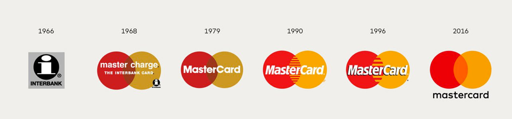
Brand evolution
The ongoing simplification and evolution of brand logos is well observed and documented. As logos needed to be more adaptable and easily reproduced there has been a trend for designers to fine tune and hone logos to be ever flatter, cleaner and less fussy. There are exceptions of course (notably Guinness), but overall the trend persists.
You can see it in the Google brand. Moving towards flat colours and a simple geometric font. The Mastercard logo has become ever more abstract and minimal.
![]()
Which brings me to Vauxhall
Following a recent engine failure I recently had to get a new car and am now the proud owner of a Vauxhall Zafira Tourer. As anyone who drives a car will know, there is no way of escaping the manufacturer’s logo as they tend to emboss them brazenly, right in front of the driver on the steering wheel. Now, as car brands go, I’ve never been a huge fan of the Vauxhall logo, but it does arguably differentiate well in the landscape of automotive badges. I’ve always thought it was too fussy and didn’t work well at a distance, too complicated, and what is that dragon all about? (turns out it’s a griffin).
The emblem has seen it’s fair share of evolution over the years, going from its original square format to the more familiar circle and various refinements and simplifications since.
![]()
…but there’s one missing! I swear it!
As recently as last week I saw a social media ad for the new Vauxhall electric Corsa-e, which I am certain featured a newer, updated version of the logo. It was small on the screen but I’m sure I didn’t imagine it. I squinted to make sure I wasn’t seeing things. It was, the same but different. Black on yellow, eschewing the 3D metallic effect for a flat vector. The griffin’s wing was, gone… and its arm! Just the head, neck and the flag minus flagpole protruding from the left side of the bounding roundel. It was nice! Another move in the right direction of simple and clean. So now, a few days later I wanted to take another look and appreciate the graphic interventions once again. But I can’t find it, anywhere. At least on Google. Is Vauxhall trying to sneak this change past us? Maybe I DID imagine it. Can you help?
I have taken the liberty of redrawing it from memory to show you what I saw, but I don’t know how accurate this is. So, behold, the new, missing, Vauxhall logo(ish)…
![]()
If you have any information regarding the whereabouts of this logo please get in touch.
Or if you think your own brand would benefit from an evolutionary leap please talk to the design team at earthware, we’ll be more than happy to help.
Addendum
Phew! Since writing this piece I have since had the advert pop up again on my news feed, and this time I took a screen shot. It does come as some relief that this wasn't a figment of my imagination even if the detail of the arm wasn't quite right. So HERE is the new Vauxhall logo, as featured on the new Corsa-e advert, still abscent from any google search...
![]()


